Pamper Yourself: Hide That
Teachable Sidebar
I am really picky with course web design. Content is probably the most important part of any video course, but if my eyes are not comfortable with it, I cannot focus. That is just me. Aesthetics and the proper use of monitor real estate play a real role when I am deciding whether to buy a course. It is rare, but it can be a deal breaker. Fortunately, AI and modern browser extensions let you do wonders. Stuff I never imagined back in the 90s, using Netscape Navigator or Internet Explorer.

So I went ahead and did some research on how to fix a small UX annoyance I have with Teachable. Found this really cool browser extension called Tampermonkey (works on Firefox, Chrome, Edge, Safari, and Opera; I use Firefox). With help from Claude Cowork, I vibe coded a small script that adds a toggle for the side menu. Yay!
What the Page Looked Like
The course is from James Lee. I am refreshing some Azure concepts. One of the best, if not the best, courses for someone pursuing AZ-104. But Teachable's web UX has the small caveat I mentioned.
Here is the lesson page out of the box. The lesson list on the left is permanent. No collapse control, no keyboard shortcut, no user setting. The video and the notes get squeezed into whatever real estate is left over.
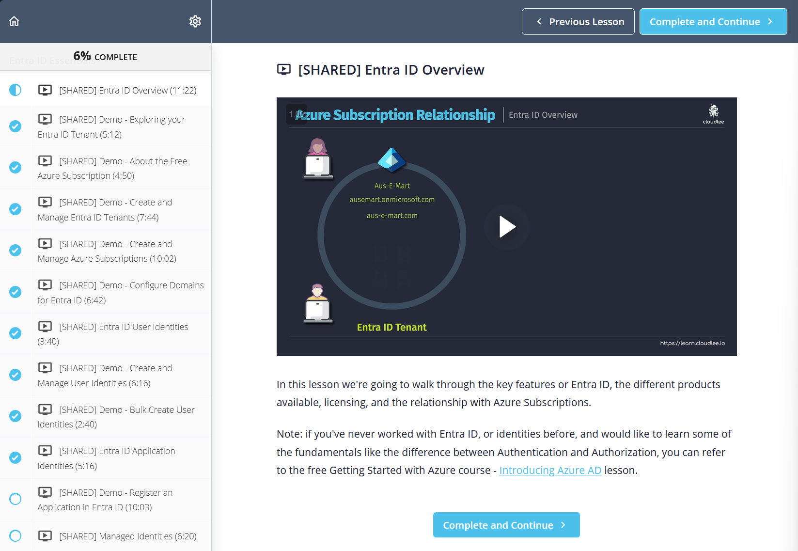
Two minutes with dev tools was enough to know this was fixable. The sidebar container has an id of courseSidebar and the main content sits inside .course-mainbar. That is all a userscript needs: hide the sidebar with CSS, widen the main content to fill the gap, add a floating button to toggle state, persist the choice in localStorage so it survives page reloads.
Now, I know some HTML. But I do not know enough JavaScript to code this myself. It would take me an hour if not more. So I told Claude Cowork what I needed and a few seconds later I had the suggestion: install Tampermonkey and paste in the JavaScript that does the magic.
The Tampermonkey Userscript
Grab Tampermonkey from your browser's extension store, open the dashboard, paste the js code. Now make the @match line your course's URL and you are set. Voilà!
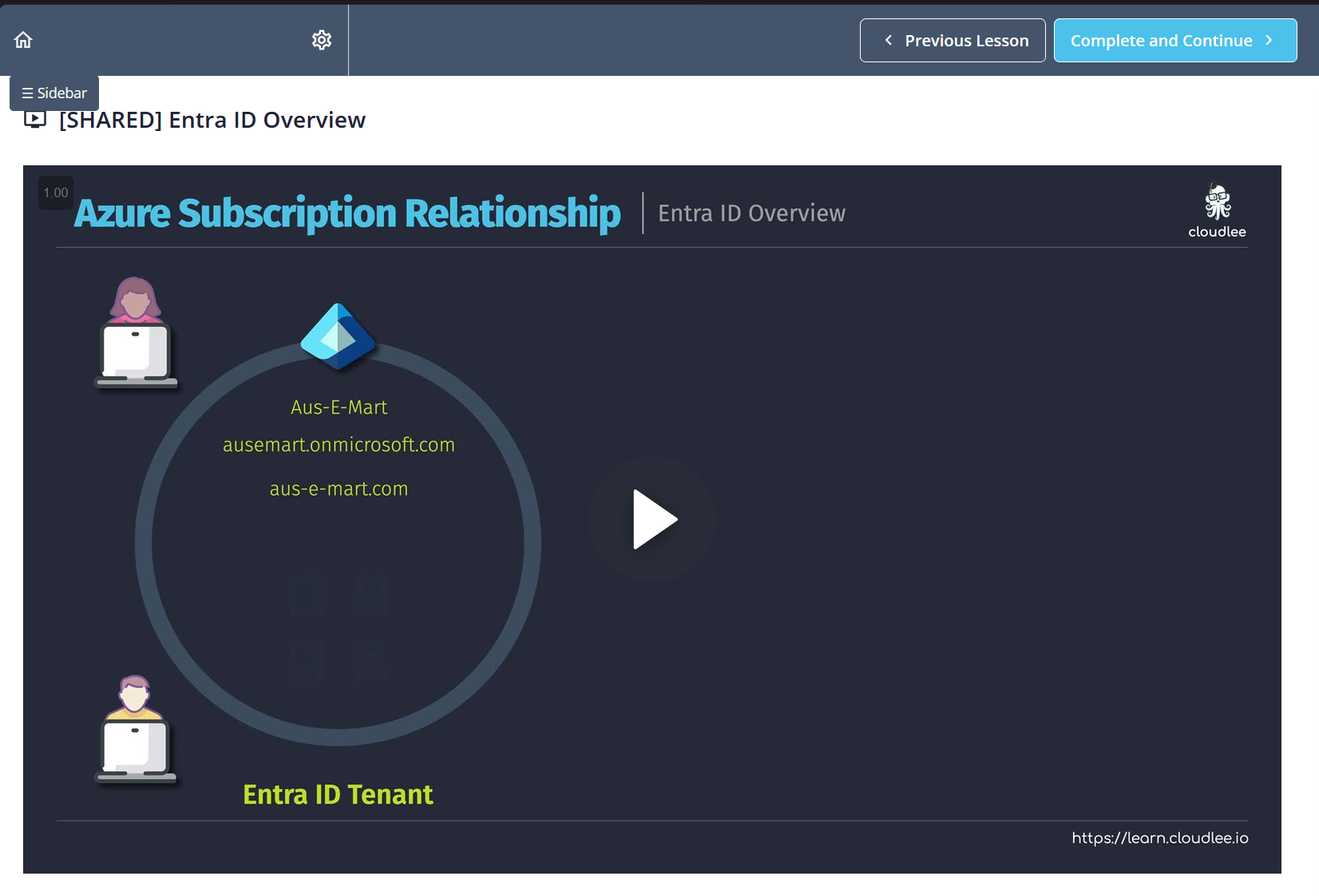
Save, reload the course page, and a small ☰ Sidebar button appears in the upper left. Click once to hide the lesson list, click again to bring it back.
Walking Through the Code
The script does four things. Let me walk through each so a JavaScript newcomer can follow along.
The style block. This adds a tiny stylesheet to the page. It only activates when the body has a class called sidebar-collapsed. When that class is on, the sidebar hides and the main content stretches to fill the space. When the class comes off, everything snaps back. Think of the class like a light switch: flip it on, sidebar disappears; flip it off, sidebar returns.
applyState. This tiny function is the only place in the script that adds or removes that class on the body. Keeping the logic in one spot is a discipline thing. If I later want to change how the toggle behaves, there is only one place to edit.
createToggleButton. Builds the little button you see in the top left. Every visual property (position, color, padding, rounded corners, cursor) is set inline in JavaScript instead of in a separate stylesheet. That way Teachable's own styles cannot accidentally override mine. The zIndex of 9999 is a large number that tells the browser "always draw this button on top of everything else." When you click the button, the handler reads the current value from localStorage, flips true to false or false to true, writes the new value back, and calls applyState to update the page.
The last three lines. These run the moment the page loads. They read the saved choice from localStorage, apply it before the button is even drawn (so you never see the sidebar flash into view and then vanish), and finally mount the button. localStorage is a small storage area the browser keeps for each site. It survives page reloads and even browser restarts. That is why the collapsed state feels permanent instead of something you toggle again every visit.
#courseSidebar and .course-mainbar are what Teachable uses on the course I was in today. If Teachable ships a redesign, the script breaks. Pop open dev tools, find the new selectors, swap them in. Two minute fix.
What This Is Not
Something important to clarify. Nothing here bypasses authentication. It is purely cosmetic. Just a client side CSS toggle on a page you already have access to.
The @match line scopes the script to one course domain. Change it or broaden it to match wherever you actually need it. Keep it narrow: userscripts that run on every URL are how you accidentally break unrelated sites.
Takeaway
You do not have to accept bad web UX. If the site is one you use often, forty lines of userscript and a short conversation with an LLM will usually get you what the product team did not ship. Small quality of life fixes have a much lower bar now, and the muscle you build doing them transfers straight to bigger web tinkering, whether that is browser extensions, red team tooling, or automation glue.